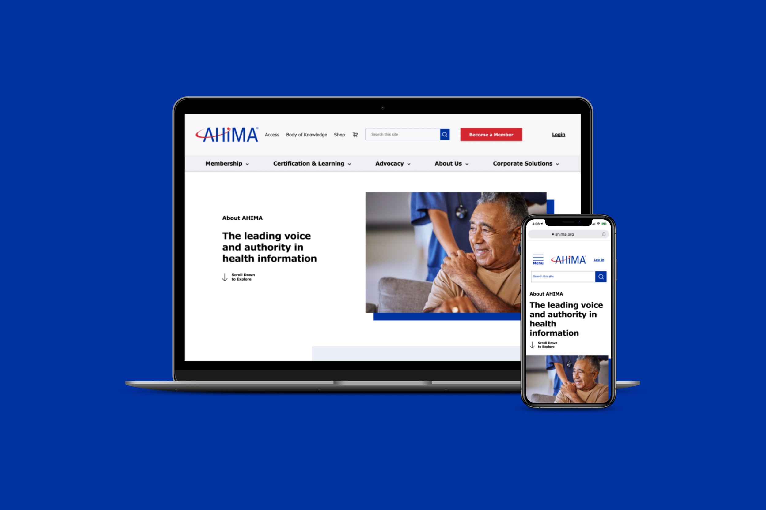
American Health Information Management Association (AHIMA)
UX Design | Information Architecture
As the lead UX Designer, I combined and reorganized site sections on the homepage while also introducing new pages. I analyzed user paths, gathered hard data, outlined proposed enhancements to the layout and components, and made concrete recommendations for improvements.
-
Duration
In progress for 3 months~
-
Tools
Figma, Microsoft Clarity, Optimal Workshop
-
My Role
Lead UX Designer
Discovery Research
Data Insights & Discovery
Data
Heat mapping and recordings from Microsoft Clarity tells us users struggle to find what they need because the navigation lacks hierarchy, and the labels are unclear and overly formal
Metrics
Data from Microsoft Clarity tells us about 47% of users are lost in the nav and the rest of the homepage is abandoned
Hypothesis
By simplifying information on the homepage and promoting AHIMA Member benefits, we can empower users to join, enhancing overall sentiment with AHIMA.
Discovery Research
User Research Insights
User Data
Our Card Sorting activity with AHIMA Steakholders and our users tells us there’s a disconnect between steakholders and users:
the labels on the left lack logical grouping for users
Steakholder Results
Red
User Results
Green
Customer Problem
How might we help audiences find what they need?
Define
How might we help audiences explore which membership is right for them?
Opportunity for Solutions
Improve the clarity and comprehension of nav by:
Renaming titles to be more action-oriented
Use common knowledge language to be more inclusive and clear for our users
Assess the effectiveness of the breadcrumb navigation by:
Tree testing
Optimize placement and visibility of important features like ‘become a member’, learn about the benefits of Membership, and purchase a Certificate to drive conversions
Development
Navigation Wireframes & Prototype
Original Navigation
Navigation MVP


