Plant Baby
UX Research | UX/UI Design
Providing plant lovers an AR plant identifier and feeding schedule experience.
Duration
3-week sprint
Tools
Mockups in Figma and User Testing completed with Maze & Zoom
My Role
Creator and Designer from concept to design
Plant Baby Prototype
Problem Statement
How might we provide an intuitive way to care for plants so people can keep their plants alive and well?
Solution
People are able to create an automatic feeding schedule by identifying unknown plants with an AR identifier and learn about the plants’ origin, their likes, dislikes, and care requirements so they can care for them properly and confidently.
Challenges
When to water and how often to water
How much sunlight or UV light is needed
General plant information about plant care and how to care for them successfully
Target Audience
Men and women in their 20’s and 30’s describe themselves as the natural, relaxed, and minimalistic type.
How Might We…
Schedule
How might we provide an automatic feeding schedule for users?
How might we recommend feeding/sunlight schedules to various users of different climates?
Information
How might we offer information and a description of specific plants and common household plants?
How might we gauge how much sun is needed for individuals plants in their specific climate?
How might we provide information about plants’ health benefits?
Instruction
How might we provide clear instructions on where to grow plants?
How might we suggest to users where to decorate their plants?


UX Research
A user survey was conducted in order to get a better understanding of peoples’ struggles when caring for plants and identify a way to solve those problems.
Quantitative Research
This data gave me information about how many plants people are likely to care for at one time and the percentage of people who want a schedule with reminders
Qualitative Research
Behavioral and attitudinal qualitative data was gathered by listening to their thoughts and feelings. People expressed how knowledgeable they feel on a scale about plant care and answered open-ended questions about their specific struggles with plant care.
It gave me insight into the problems we all face as plant parents.
User Interviews
Interviewees had an interest in understanding more about their plants, the health benefits, and needed to know about regular maintenance like watering and how much sunlight is needed.
Most people forget to water their plants which could be in turn why their plants die.
Users need reminders to care for their plants and additional details to care for them properly.
The plant nursery with personal plant details was added to increase user engagement and a friendly vibe.
Competitive Analysis
I looked at 3 different plant apps.
I read the reviews on their app store to gather additional information that could help the app stand apart from the crowd.
Plantiary
Plantiary included a scheduling system of plants’ likes, location, and indoor/outdoor options.
Overuse of advertisements
Unintuitive icons and it didn't tell how often to water plants which is the most important piece.
Picture This
Good use of UI, articles, and AR plant identifier.
Instead of articles, I used plant care tips. I wasn't sure how this app operated exactly.
I needed more from this app and I couldn't get it.
Hedira
The friendly feedback system and plants’ descriptions & likes/dislikes were useful.
Confusing onboarding, no navigation in beginning.
The app doesn't tell you how to care for your plants, you tell it how you'll care for them.
Personas
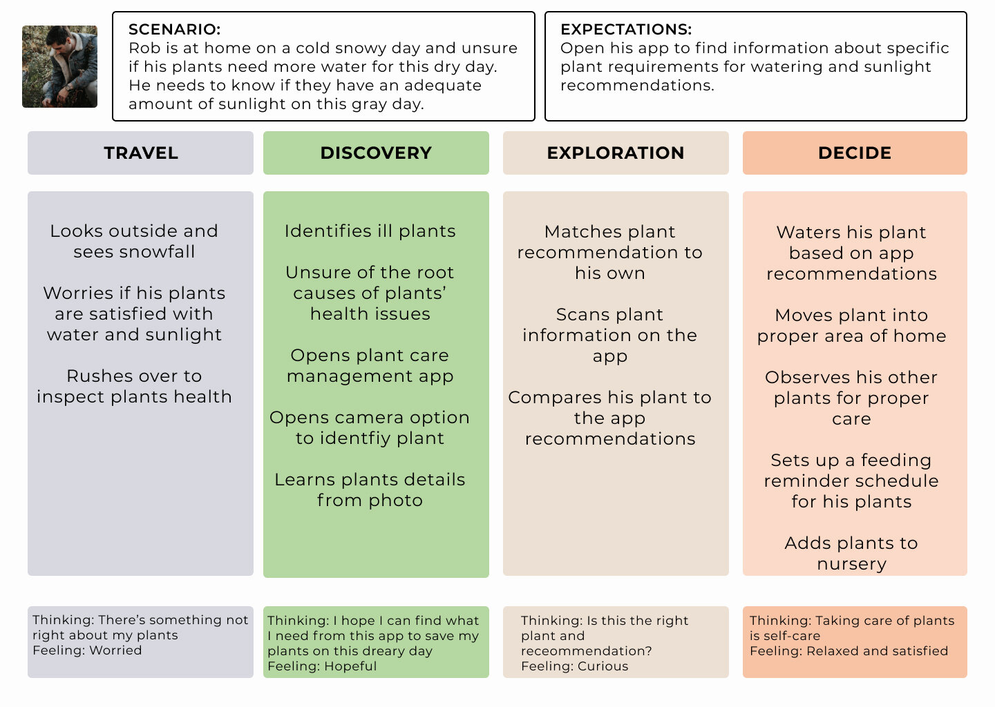
Two personas and empathy maps were created to pinpoint what our users' needs and goals were when using the app, and understand hesitations or problems when caring for their plants.
Rob is a city dweller and lives in an apartment.
He wants to use his indoor plants as a food resource and health benefits.
He’s unsure of when to water his plants and how much sunlight they should get.
He has an interest in UV light in case he may need more sunlight in his apartment.
Jane also lives in a small, studio apartment so air quality is important to her.
Her studio overlooks the community pool and she enjoys having plants near the window and just outside so pests are a concern for her as are plants that are safe for animals.
She also needs reminders for when to water and reminders to care for her plants that are outside since they are not in her walking view all the time.
Empathy and Journey Maps
The personas and maps inspired me to create a schedule with an automatic feeding reminder and an AR plant identifier. I continuously came back to reflect and empathize with users on what they wanted and needed from this app.


User Stories
Here are the most important features for the app
1. An automatic feeding schedule,
2. Provide additional information about plant care,
3. Sunlight recommendations, and
4. Plant health benefits
Site Map
The purpose of the site map is to outline the flow the user would take in the app.
Several versions were sketched out in order to find the balance between ease of use and user engagement.
The user stories were kept in mind as the main goals and the steps of the flow should feel easy and intuitive. As this flow was created, it was important that the design of the screens would feel like a fun experience and priority information could be found easily without getting lost in the app.
Low-Fidelity Wireframes
At the beginning of the design process, wireframes were created in Figma for testing purposes.


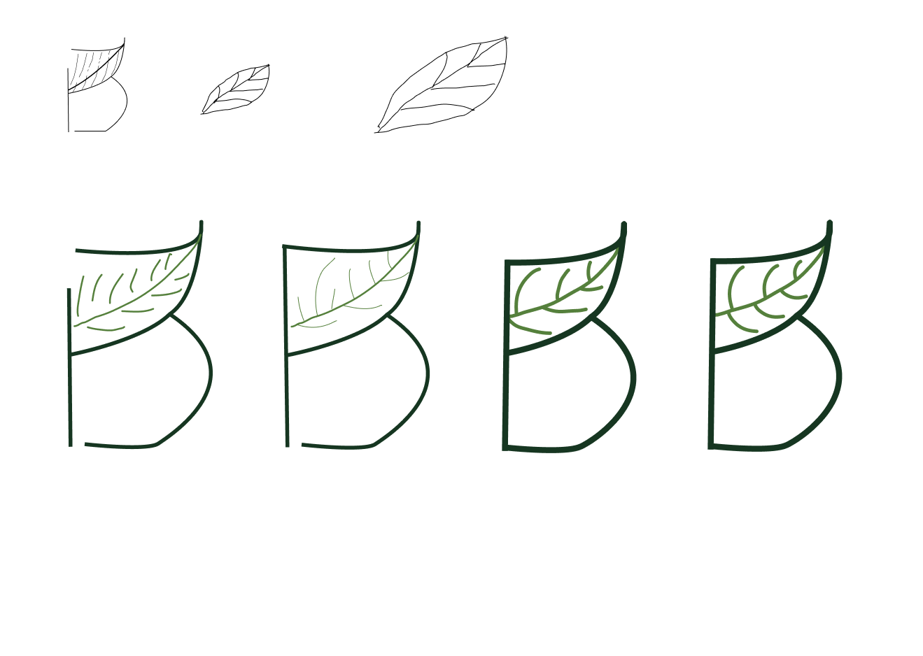
Branding & Logo
The branding was inspired by the target audience. The color palette represents the minimalistic, relaxed style with the natural beige and natural environmental green.
All of the color combinations are in compliance with the Web Accessibility Guideline standards.
The logo, which also represents a simple and minimalistic style, was inspired by research from Pttrn, Behance, and Dribbble.


High-Fidelity Mockups
Scroll to see the final screens.


User Testing
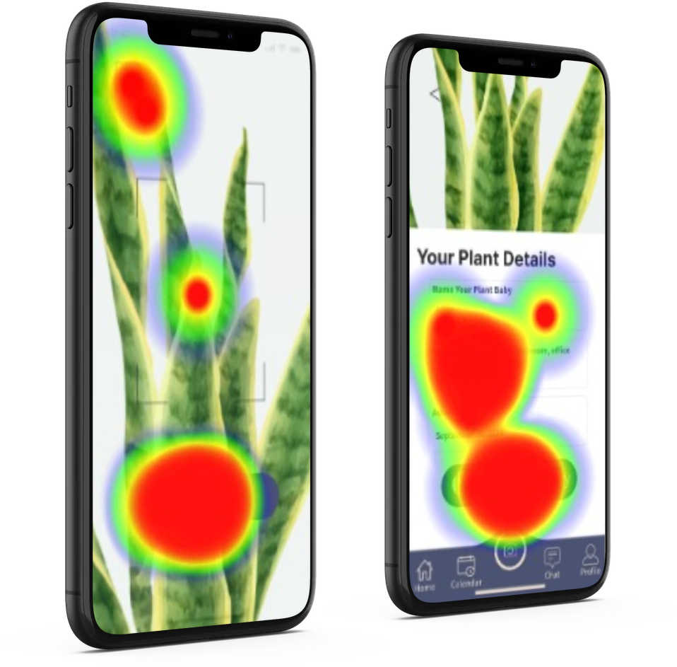
The main goal was to find usability problems, identify if the user flow worked as intended, and gain any valuable feedback about their experience.
3 users agreed to do testing. We checked in with men and women over Zoom because that was our target audience.
Here is what they had to say about their experience:
Brian, Software Engineer
"It's easy to find plants you've entered and to add new plants. I like the plant care tips."
Josie, Freelance Designer
"Beautiful and makes me want to take care of plants. Love the UI design and color theme. VERY much!"
Heidi, Web Designer
“Super intuitive and flows easily. I was able to find everything quickly. I like it. I haven’t seen an app like this before.”

Before Testing

After Testing

Before Testing

After Testing

Testing Takeaways
The testers had positive reactions to the interface and color palette. They provided useful feedback about what they’d like to see more of as well.
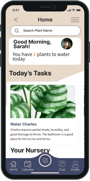
A menu icon overflow was added to distinguish it from the profile page.
A search bar was added to the home page so users could easily find their plants and the visual hierarchy of “today’s tasks” was enlarged to show priority over the Nursery section. This way they can see everything they need all on one screen.
Solution: Schedule it.
People need an automatic feeding schedule for their plants so they don’t neglect their plant babies.
They need additional information about the plants’ origin, their likes, dislikes, and care requirements so they can care for them properly and confidently.
You’re a good plant parent.
Learnings & Summary
What worked
For version 1, a feeding schedule and AR plant identifier were key to keep users engaged and satisfied with their experience.
People also really loved the color palette because it made them feel calm and relaxed which is how my target audience describes themselves.
What didn’t work
The visual hierarchy in the initial hi-fi mockups needs some work so users could easily find and see what they were looking for.
This was iterated after the first prototype testing.
What did I learn?
I would add more features to keep users engaged with the app because many people said they want more to explore.
Specifically, users want info about heath benefits, soil irrigation, pest repellants, etc. Perhaps these are features for version 2 or 3.
Business Goals & Reflections
I am still learning how to properly care for plants myself and that there are also a lot of people who need help on how to care for plants. They may not have the knowledge and experience, but are interested and care about plants. I would love to continue with version 2 or 3 of this app.
If this were a real application, I would increase the revenue of sales through the app by adding an e-commerce store for users to purchase soil, organic pest repellants, and decor. There is a large audience of plant parents, they just need some extra help caring for their plant babies. The research was fun and I felt there were several different ways this app could be designed. It’s exciting to think about all the possibilities.
What People Are Saying
"First, it made me feel happy with the color palette, other visual elements, and it made me want to take care of my plants."
— June
"I love the images and color scheme. Very calming and relaxing. All of the information was laid out really well, too, and it was super easy to find what I needed."
-Brian
"Love the feel of the app, very fun and cute. Felt like it was super intuitive and simply laid out. I would definitely use this app!"


